I downloaded data from the BEAM dashboard (found here: https://data.cdc.gov/Foodborne-Waterborne-and-Related-Diseases/BEAM-Dashboard-Serotypes-of-concern-Illnesses-and-/fvm6-ic5r/about_data) I specifically filtered for data from year_first_ill is > 2020 so there should be about 5 years of data.
Now to lead in my packages:
library(here) #to set paths
here() starts at C:/Users/esthe/Documents/GitHub/EstherPalmer-portfolio
library(dplyr) #for data processing/cleaning
Attaching package: 'dplyr'
The following objects are masked from 'package:stats':

    filter, lag
The following objects are masked from 'package:base':

    intersect, setdiff, setequal, union
library(tidyr) #for data processing/cleaninglibrary(skimr) #for nice visualization of data library(eeptools) #I need to remove commas and this is the easiest way I found
There are 339 observations of 10 variables. Some of these variables probably shouldn’t be characters like Year. Some of these categories also feel unnessesary, like table_id which looks like it just contains info from several other columns. Also Pathogen should be Salmonella for all of this data, so it is unhelpful (and we can see there is only one observation). It does look like there’s no missing data though. There are 36 unique serovars which is cool!
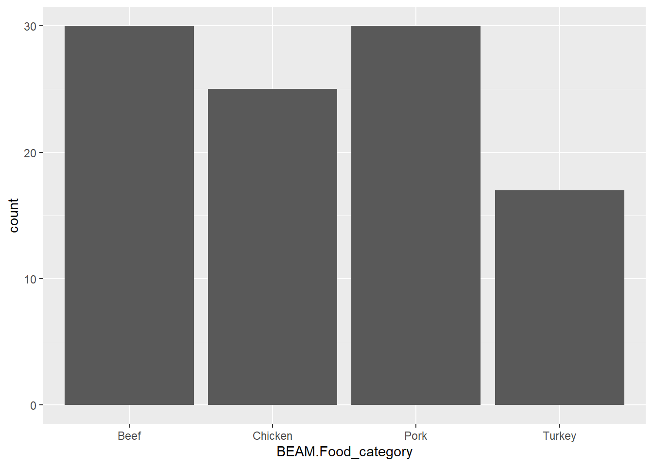
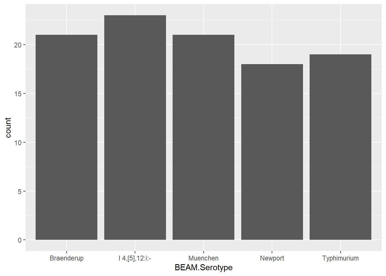
 BEAM.Food_category BEAM.Year_first_ill        BEAM.Serotype
 Beef   : 79        Min.   :2021        I 4,[5],12:i:-: 23
 Chicken:108        1st Qu.:2021        Braenderup    : 21
 Pork   :102        Median :2021        Muenchen      : 21
 Turkey : 50        Mean   :2022        Enteritidis   : 20
                    3rd Qu.:2022        Typhimurium   : 19
                    Max.   :2023        Newport       : 18
                                        (Other)       :217
 BEAM.No_of_illnesses BEAM.No_of_outbreaks   BEAM.Year    BEAM.Year_range
 Min.   :  0.000      Min.   :0.0000       Min.   :2021   Length:339
 1st Qu.:  0.000      1st Qu.:0.0000       1st Qu.:2022   Class :character
 Median :  0.000      Median :0.0000       Median :2022   Mode  :character
 Mean   :  5.752      Mean   :0.1888       Mean   :2022
 3rd Qu.:  0.000      3rd Qu.:0.0000       3rd Qu.:2023
 Max.   :181.000      Max.   :4.0000       Max.   :2023

 BEAM.Running_total_by_year_range
 Min.   :  0.00
 1st Qu.:  0.00
 Median :  0.00
 Mean   : 38.68
 3rd Qu.: 29.00
 Max.   :679.00
I can now see that the most common serovars are monophasic Typhimurium (I 4,5,12,:i:-), Braenderup, Muenchen, Enteritidis, Typhimurium, and Newport.
This just leaves year range as something that should maybe be fixed. This one is tricky though, because each outbreak is going to have a separate year range. Also given how I filtered the data by year first ill this column may not be helpful.
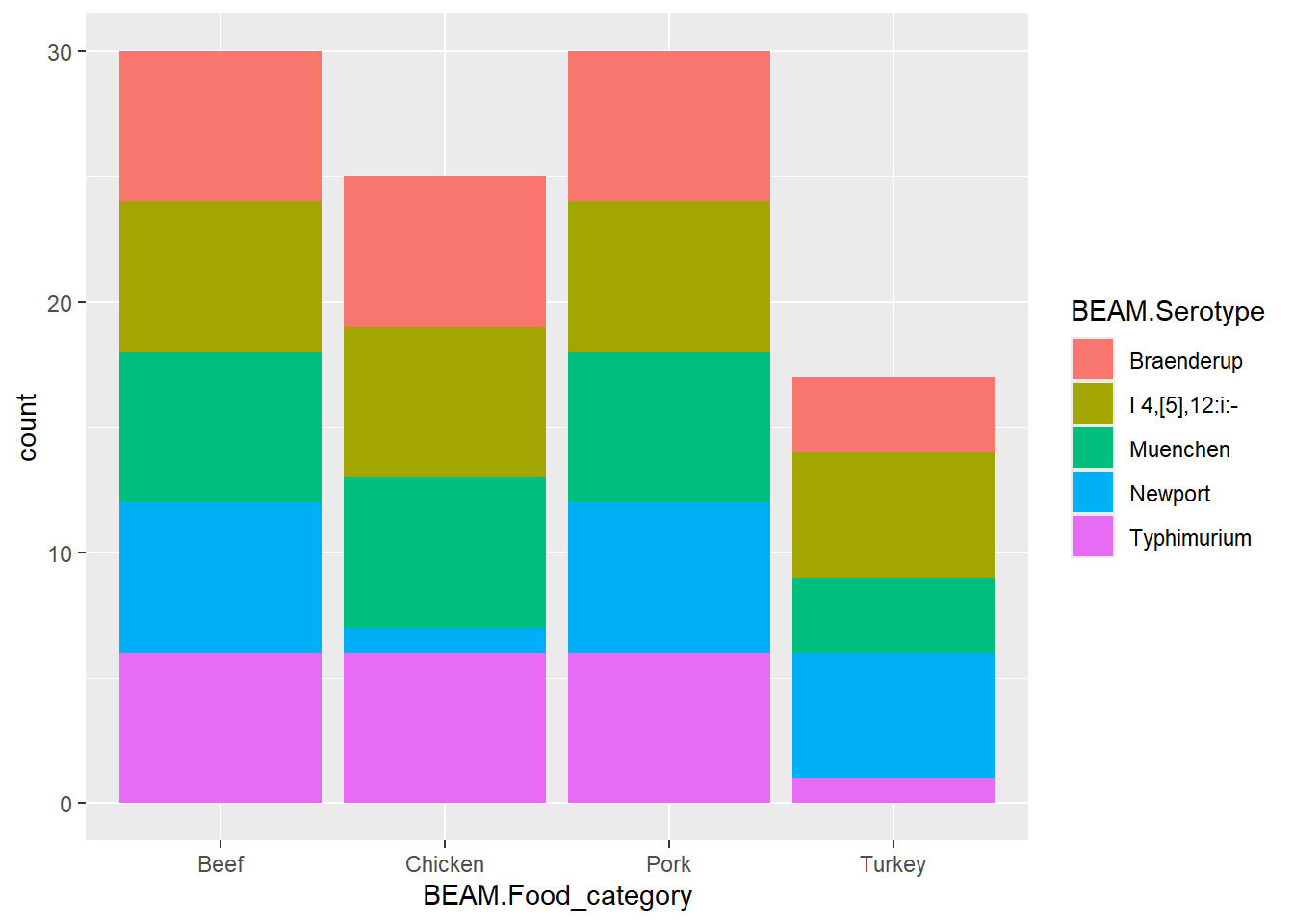
I want to know what commodities are associated with my top 6 serovars
This gets counts of these top commodities and the top serovars, then proportion of each commodity that responds to each serovar!
This section is contributed by Rebecca Basta
AI prompt used: “Write R code to generate synthetic outbreak data similar in structure to CDC BEAM Salmonella dataset with 339 rows, 10 columns, and categorical + count variables.”
set.seed(123) # reproducibility
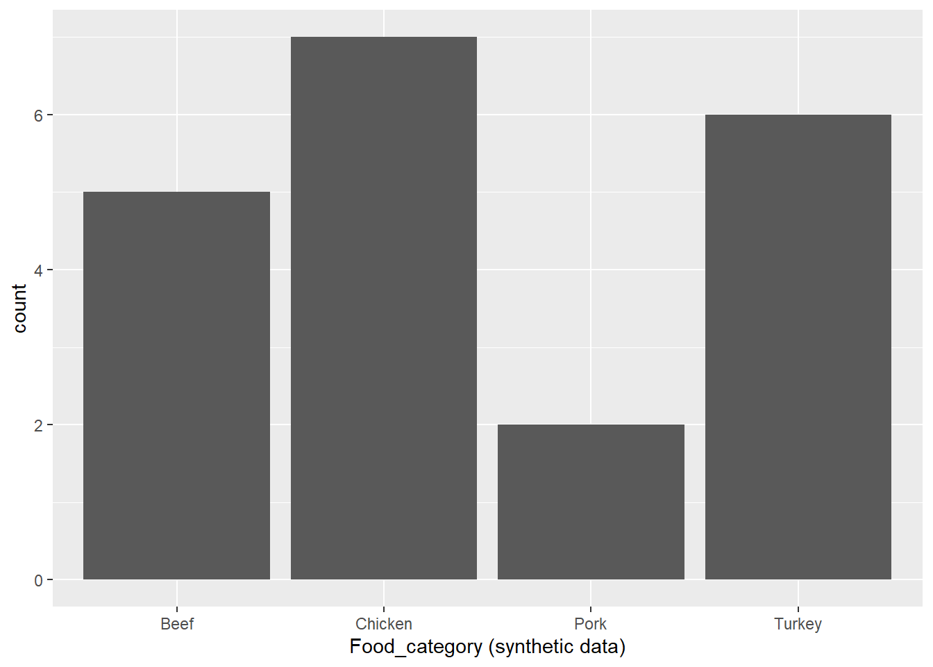
# Number of observations similar to originaln <-339# Create synthetic datasetsynthetic_data <-data.frame(Food_category =sample(c("Chicken", "Beef", "Pork", "Eggs", "Vegetables", "Fruit", "Seafood", "Dairy", "Turkey"), n, replace =TRUE ),Serotype =sample(paste("Serotype", 1:36), n, replace =TRUE ),Year_first_ill =sample(2021:2024, n, replace =TRUE),Year =sample(2021:2024, n, replace =TRUE),No_of_illnesses =rpois(n, lambda =25),No_of_outbreaks =rpois(n, lambda =3))# Running total by year rangesynthetic_data <- synthetic_data %>%arrange(Year) %>%mutate(Running_total_by_year_range =cumsum(No_of_illnesses))glimpse(synthetic_data)
 Food_category        Serotype         Year_first_ill      Year
 Length:339         Length:339         Min.   :2021   Min.   :2021
 Class :character   Class :character   1st Qu.:2021   1st Qu.:2022
 Mode  :character   Mode  :character   Median :2023   Median :2023
                                       Mean   :2022   Mean   :2023
                                       3rd Qu.:2023   3rd Qu.:2023
                                       Max.   :2024   Max.   :2024
 No_of_illnesses No_of_outbreaks Running_total_by_year_range
 Min.   :12.00   Min.   :0.000   Min.   :  19
 1st Qu.:21.00   1st Qu.:2.000   1st Qu.:2079
 Median :24.00   Median :3.000   Median :4153
 Mean   :24.59   Mean   :3.006   Mean   :4157
 3rd Qu.:28.00   3rd Qu.:4.000   3rd Qu.:6268
 Max.   :41.00   Max.   :8.000   Max.   :8336
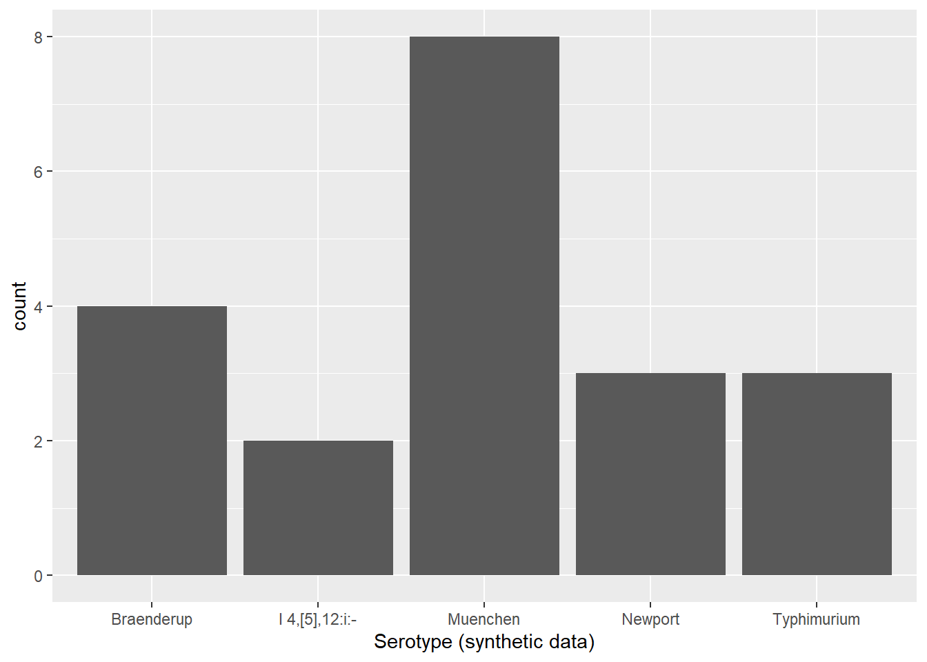
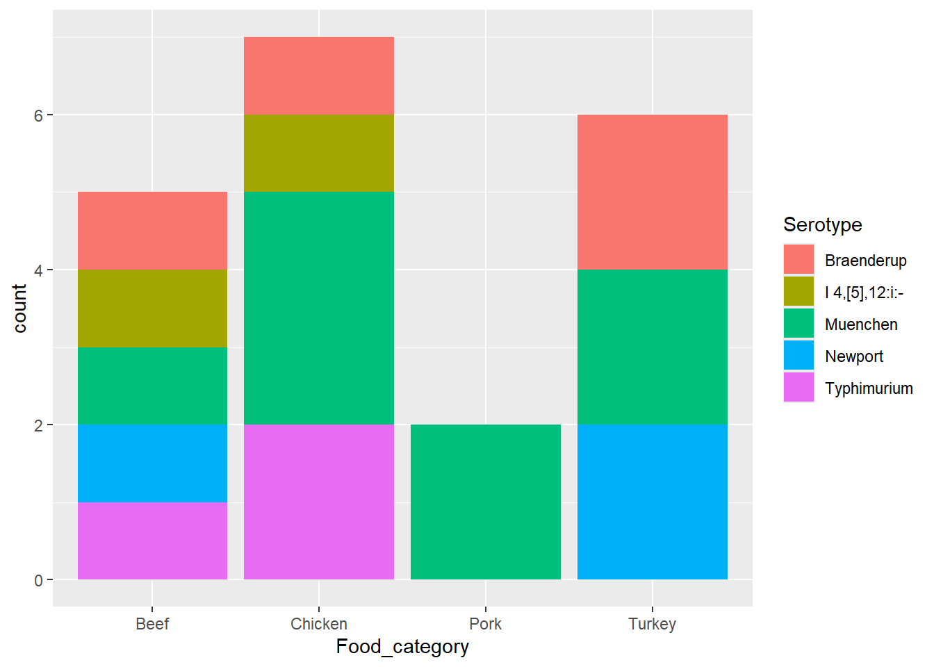
#renaming the serotypes from my synthetic data, so the plots can have the correct axis names#Before I did this, the plots were blank. I asked AI why they were blank and it was because the variable names didn't match, which is why I recoded them.synthetic_data <- synthetic_data %>%mutate(Serotype =recode( Serotype,"Serotype 1"="Typhimurium","Serotype 2"="Braenderup","Serotype 3"="Muenchen","Serotype 4"="Newport","Serotype 5"="I 4,[5],12:i:-" ) )
#Created a subset for the plots to have the same plotsplot_subset <-subset( synthetic_data, Food_category %in%c("Beef", "Chicken", "Pork", "Turkey") & Serotype %in%c("Typhimurium","Braenderup","Muenchen","Newport","I 4,[5],12:i:-" ))
p3 <-ggplot(plot_subset, aes(x = Food_category, fill = Serotype)) +geom_bar() +labs(x ="Food_category", y ="count", fill ="Serotype")p3
The synthetic data is a little different then the orginal data because the food catergory and serotype are random in the synthetic data. Other then that, the synthetic data and orginal data are the same. They both include 339 rows, 10 columns, and the same variables.